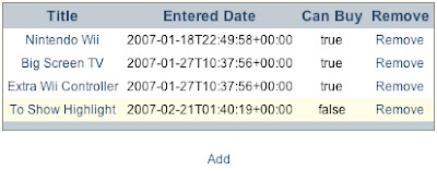
Step 1: Enable File Serving in Commanche
If you've been following the Wanted tutorials and are using the squeak-web image, you'll have to restart the Commanche server and enable file serving. Enter the following in a new workspace, highlight it, and "do it":
See David Shaffer's Seaside tutorial for more details.
| ma seaside |
WAKomEncoded39  stop.
seaside := WAKomEncoded39  default.
ma := ModuleAssembly core.
ma serverRoot: FileDirectory default fullName.
ma alias: '/seaside' to: [ma addPlug: [:request | seaside process: request]].
ma documentRoot: FileDirectory default fullName.
ma directoryIndex: 'index.html index.htm'.
ma serveFiles.
(HttpService startOn: 8080 named: 'httpd') plug: ma rootModule
This will stop Commanche and restart it with support for serving files and Seaside applications. Note that it sets the document root to FileDirectory default. If you are starting Squeak by dragging the image file onto the Squeak executable, this should be the directory of the Squeak executable. You can find out exactly what it is by entering "FileDirectory default fullName" in a workspace, highlighting it, then doing a "Print It".
Test it by flipping to your browser and going to http://localhost:8080. You should see a directory listing of the default directory.
Step 2: Create a CSS File
Create a new text file called "wanted.css" in the default directory that contains the following:
body {
  margin:50px 0px; padding:0px;
  text-align:center;
  font: 12px arial, sans;
}

table {
  margin-left: auto;
  margin-right: auto;
  border: 1px solid #848370;
  border-collapse: collapse;
  margin-bottom: 20px;
}

th {
  background-color: #b4bfcc;
  padding: 4px;
  font-size: 14px;
}

td {
  padding: 4px;
}

a {
  color: #103b61;
  text-decoration: none;
}

a:hover {
  text-decoration: underline;
}

form {
  margin-left: auto;
  margin-right: auto;
  width: 400px;
  text-align: left;
  background-color: #dee3e4;
  border: 1px #ccc solid;
  padding: 10px;
}


form input, textarea {
  border: 1px solid #b4bfcc;
  padding: 2px;
  width: 98%;
  margin-bottom: 10px;
}


form textarea {
  height: 150px;
  font: 12px arial, sans;
}

form input.submit {
  margin: 0;
  width: 50%;
}
Step 3: Wire the CSS File Up to the Components
To link to the css file, we'll implement updateRoot in WTComponent:
Since both of our view components (WantedList and WantedEditor) inherit from WTComponent, they will both contain the link to the css file.
updateRoot: anHtmlRoot
   super updateRoot: anHtmlRoot.
   anHtmlRoot linkToStyle: '/wanted.css'
Flip back to the browser and refresh:
 Much better, huh? The application looks completely different and we didn't have to touch any rendering code or a single line of html. I'll be the first to admit that my design skills aren't that inspiring--if someone comes up with something better they'd like to share, I'll post it here.
Step 4: Tweak the WATableReport Row Colors
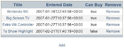
If you create more than 3 wanted items, you will see that yellowish background appear. That is WATableReport doing some styling for us. If we wanted to change it so that every other line was shaded with a light gray color, we would edit WantedList>>intialize by finding where the wantedReport instance is being assigned and changing it to the following:
wantedReport := WATableReport new rows: rows;
  columns: columns;
  yourself.
wantedReport rowPeriod: 1.
wantedReport rowColors: {'#ffffff'. '#eee'}
See David Shaffer's WATableReport tutorial for more about styling the table report object. After clicking the "New Session" link, you should see the following:

Conclusion
Making Wanted look decent was pretty simple using an external css file. Since Wanted really only consists of one table component and one form component, I was able to get away with not using divs, classes or ids. In an application with more depth these would be required.
6 comments:
Superb tutorials. Much more of this kind of clear incisive style is needed to promote Seaside. Made a big difference to me. Well done
I certainly second that. While the essense of this tutorial is pretty much the same as "creating a blog in 15 minuts" (and a wanted items list can easily be converted into a blog), it is so well laid-out and followed through!
Thanks guys: sorry I haven't updated it in a while. More content coming soon hopefully.
I agree with the others. Thanks for this inspiring tutorial series on Seaside!
Thanks for the clear and helpful Tutorial. I'm following it using Seaside 2.8. There is a change to the API for linking to a stylesheet. It's described quite well here: http://leftshore.wordpress.com/tag/visualworks/
Nice Article.
Post a Comment